Data Connections in Workflows
On the Data connections tab of a workflow, you pre-wire chart, table, and text field shapes to data collections or transformations. When someone creates a presentation from that workflow, the wiring is already in place - they only enter parameter values (dates, IDs, and so on).
One shape can only be connected to one data source. One source can feed many shapes.
For an end-to-end walkthrough (template → collections → transformations → connections → recurring runs), see Building a Recurring Report (Factsheets).
Why connect data in the workflow?
| Without connections | With connections |
|---|---|
| Users pick sources and shapes every time | Sources are pre-linked; users set parameters only |
| Easy to wire inconsistently across runs | Same shapes always use the same collections/transformations |
| More setup for each new deck | Faster, repeatable production |
Prerequisites
- Template - slides with charts, tables, and/or text fields; clear shape names; quantitative (or mixed) slide categories where those shapes live.
- Data - collections (and optional transformations) with parameters and matching files in the warehouse or landing zone.
- Workflow deck structure - specific slides (not "any template from this category") so connectable shapes appear. Connections only target fixed slide templates.
The Data connections tab
Open a workflow → Data connections. The header shows how many shapes are connected vs. not connected, plus a short reminder: connect via connection points; one shape → one data collection.
Toolbar
Controls apply to both views:
- Search - filter sources and transformations by name
- Connected only - hide everything that is not part of a connection (in Graph, upstream files that feed a connected transformation stay visible)
- Charts / Tables / Text fields - toggle which shape types appear (text fields are off by default)
- Slide filter - all slides, or one slide at a time
- Flat / Graph - switch layout (see below)
Use the eye icon on a source or shape to preview data or the template shape. On a transformation preview, Edit this transformation opens that transformation so you can adjust its steps from here - see Transformations for the full editor. Use the red X on a connected shape to disconnect.
Flat view
Two columns: Data Sources on the left (collections and transformations) and Connectable Shapes on the right.
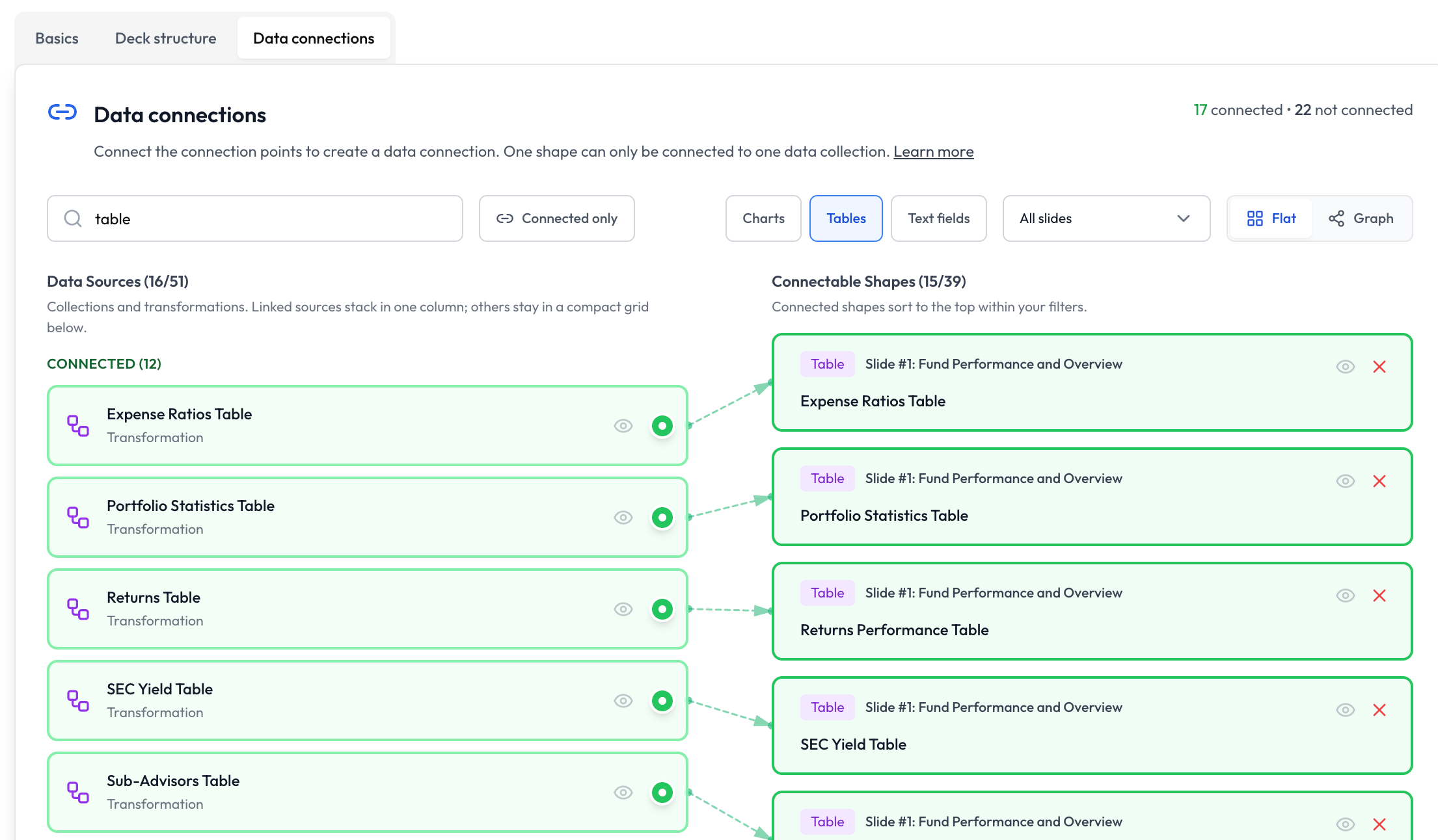
- Connected sources stack under Connected; everything else sits in a compact Not connected grid
- Connected shapes sort to the top within your filters
- Green dotted lines show active links from source connection points to shapes
Graph view
A left-to-right pipeline: Data files → Transformations → Slide shapes. Use this when you want to see how raw collections feed transformations before they reach slides.
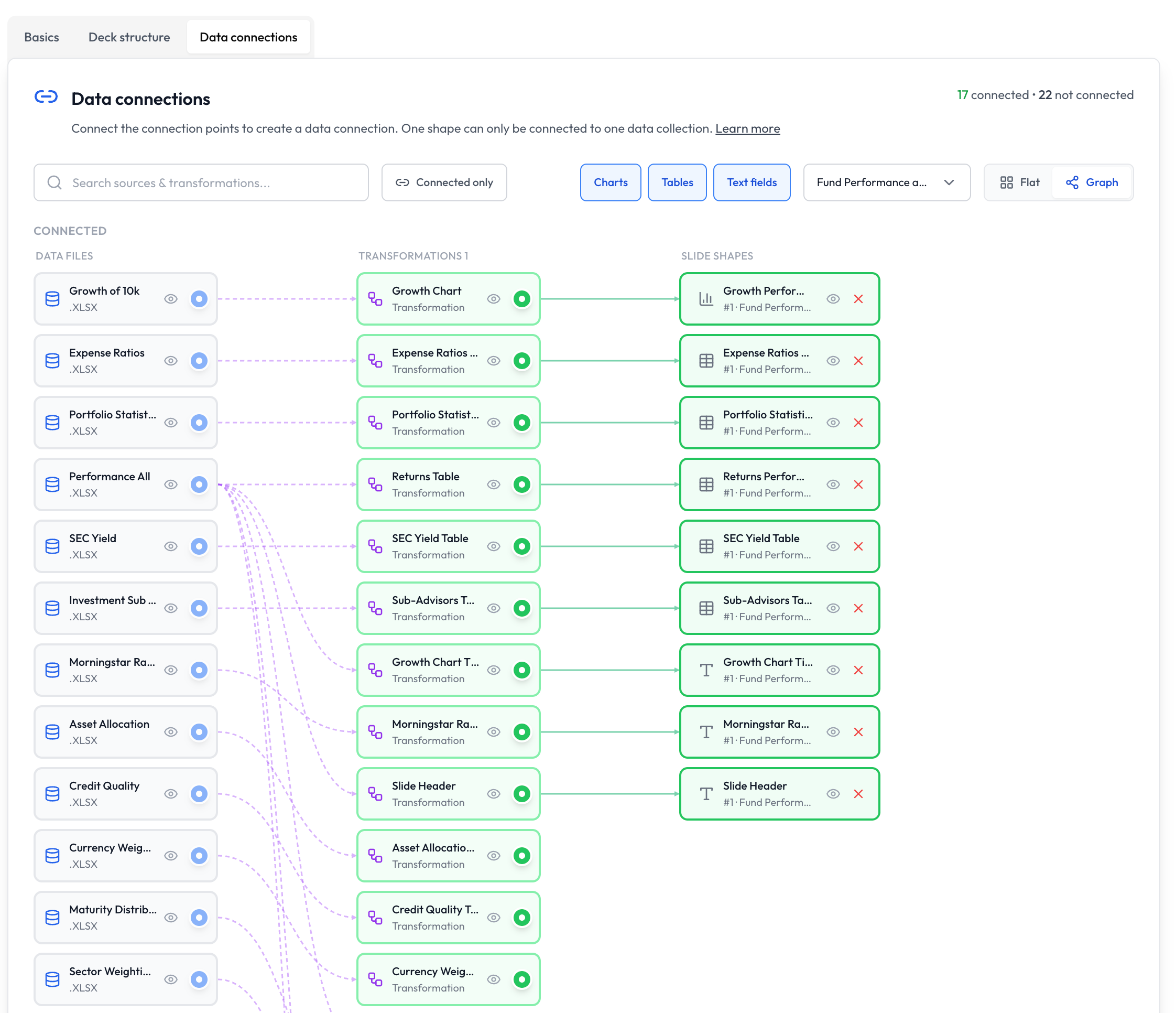
- Dashed purple lines are dependencies (file → transformation, or transformation → transformation)
- Solid green lines are data connections (source → slide shape)
- Connected work sits in the upper band; fully unconnected nodes drop below
Creating a connection
- Ensure the deck structure uses specific slides that contain the shapes you want to wire.
- Open Data connections (Flat or Graph).
- Click the circular connection point on a collection or transformation (right edge of the card).
- Click the target shape. A green link appears.
- Or press Esc (or click cancel) to abort while a connection is in progress.
You can start from either view. The rule is the same: one shape accepts only one source.
Removing a connection
Click the red X on the connected shape. The link disappears. If that was the last connection on a structure item, automatic slide locks may relax (see below).
Automatic adjustments
Connecting data needs a predictable target slide. Creating a connection therefore:
- Sets that deck-structure item to Use only once
- Locks it to the specific slide that contains the connected shape
Without that, AI could generate multiple slides or pick another template from the category, and the connection would be ambiguous.
Conflicts
If a structure item still allows multiple slides from the same category, connecting a shape on Slide A makes shapes from other slides in that item unavailable. To wire data on two slides, give each slide its own structure item.
Data Driven Only workflows
In workflow settings, set Slide deck creation mode to Data Driven Only when layout and data must stay fixed (factsheets, regulatory packs):
- AI tone, style, default prompt, and per-slide custom instructions are disabled
- Deck structure must use specific slides only
- Users configure parameters, then go straight to Populate (Build and Structure are skipped)
- Connected shapes fill deterministically; unconnected shapes keep template placeholders
See Using Data in Presentations - Data Driven Only and the factsheets tutorial.
Chart connections
Data flowing into charts needs to fullfill the following criteria:
- The connected data needs to generaly follow the shape of the sample data in the template. In PowerPoint, Right-Click the chart area and select "Edit Data". This will show you its shape: The category axis is generally represented in the left-most column, the series are followed in further column. Octigen simply replaces this sample data with data you connect in the workflow.
- Numeric series must be formatted as plain numbers. Do not try to do numbers formatting (e.g. adding percentage signs, suffixes, change number of digits) as part of the transformation you connect to charts. Instead, to format the numeric display of charts, open the template in PowerPoint, right-click on the Axis, then Format Axis -> Axis Options -> Number and change the formatting there.
- The number of series can vary from the template, however we suggest to always define the maximum number of series you expect in the template, to give you the option to style them all. If Octigen inserts more series than your template defines, the remainder series will likely use a copied style from a preview series, and might be hard to distinguish optically.
- Octigen & PoweePoinr generally handles any number of categories you pass in, however not all chart types are visually suited for a high number of categories - e.g. a pie chart with more than ~8 categories will often become hard to read.
To format the numeric display of charts, open the template in PowerPoint, right-click on the Axis, then Format Axis -> Axis Options -> Number and change the formatting there.
Table connections
When you let data flow into tables via connections, it's up to the connected data to be formatted exactly how you want the cell values to look. Rows & columns in your data (warehouse object or transformation) map one-to-one to what is displayed in the table.
- In your template, make sure to add the maximum number of columns you expect to appear in your data, as Octigen is able to shrink the number of columns, but currently not grow it.
- For rows, Octigen is able to both append and delete them. If your data has more rows than the template's table, please note that (a) the required space of the table will grow and (b) it will copy the style of the last row in the table; Hence, for tables with distinctly styled rows, the result may not be as desired - hence, use distinct row styling only when the maximum number of rows is given in advance (and add that maximum number into your template).
Text field connections
Text fields map tabular data into multi-paragraph text:
- One data row → one paragraph
- One cell (column) → one run within that paragraph
Turn on Text fields in the toolbar to see text shapes. Prefer a transformation when the text should be filtered or computed rather than raw columns.
What users see when they create a deck
- Choose the workflow as usual.
- The Data Configuration modal lists connected shapes and required parameters.
- Enter parameters → validate → continue.
- In Data Driven Only mode they land on Populate; otherwise Build may still run for non-data content, with connected data treated as fixed.
Details: Configuring Data for Slides.
Connected vs. ad-hoc data
| Aspect | Connected in the workflow | Ad-hoc during Build |
|---|---|---|
| Setup | Once, in the workflow | Every presentation |
| User effort | Parameters only | Pick sources and shapes |
| Consistency | High | Variable |
| Best for | Recurring reports | Exploratory decks |
Best practices
- Name shapes clearly (
Expense Ratios Table, notTable 1) - Prefer transformations that already match the target chart/table layout before connecting
- Use shared parameter names across collections so one date/ID resolves the whole deck
- Connect only shapes that must stay data-driven; leave exploratory content unconnected
- After wiring, create a test deck and validate parameters once
Troubleshooting
No connectable shapes
Cause: Deck structure has no specific slides with charts, tables, or text fields.
Solution: Add specific slide templates (not "Any slide template") under quantitative or mixed categories.
Shape unavailable / grayed out
Cause: Another connection in the same structure item already locked a different slide in that category.
Solution: Remove the conflicting connection, or split into separate structure items per slide.
Data source missing
Cause: No collections or transformations in the workspace.
Solution: Create them under Data, then return to the workflow.
Validation fails when creating a presentation
Cause: No file matches the parameter values, or a transformation preview fails for those parameters.
Solution: Check the collection / transformation base data, upload via the collection or Data Landing Zone, or adjust parameters.
Next steps
- Building a Recurring Report (Factsheets) - full setup from template to recurring production
- Transformations - prepare data before connecting
- Data Landing Zone - bulk-upload source files
- Deck structure - lock specific slides for connections
- Data collections - define parameters and sources
- Configure data for slides - the parameter validation experience users see